Histogram Training Slides
Histogram Training Slides
Couldn't load pickup availability
Histograms are the most common types of frequency diagrams
--
A Histogram is a basic graphing tool that displays the relative frequency or occurrence of continuous data values showing which values occur most and least frequently. A histogram illustrates the shape, centering, and spread of data distribution and indicates whether there are any outliers.
In other words, it's a graphic way to summarize data. Size is shown on the horizontal axis (in cells) and the frequency of each size is shown on the vertical axis as a bar graph.
The length of the bars is proportional to the relative frequencies of the data falling into each cell and the width is the range of the cell (data is variable measurements from a process).
Histograms are used to plot density of data, and often for density estimation: estimating the probability density function of the underlying variable.
The total area of a histogram used for probability density is always normalized to 1. If the length of the intervals on the x-axis are all 1, then a histogram is identical to a relative frequency plot.
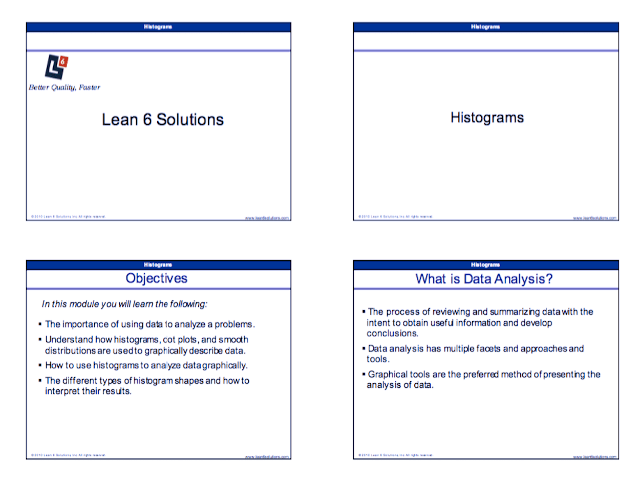
In this module you will learn the following:
- The importance of using data to analyze a problems
- Understand how histograms, dot plots, and smooth distributions are used to graphically describe data
- How to use histograms to analyze data graphically
- The different types of histogram shapes and how to interpret their results
You can use these slides as a refresher for you, or in a training/classroom environment. The Histogram Training Course is designed for business professionals who are interested in applying process improvement techniques in their workplace. Some of these professionals may include Quality Managers, Continuous Improvement Managers, Process engineers, etc.
When to Use a Histogram
- When you want to get a graphical indication of the capability of the process in meeting customer targets.
- When you are beginning to analyze data because it gives you an idea of what is happening in the process.
- After you have made changes to the process, to determine if you have successfully removed variation or shifted the process mean.
[caption id="attachment_17474" align="alignnone" width="1250"] Sample image for training slides[/caption]
Open Source Six Sigma
More products from iSixSigma


